The use of color is a fundamental aspect of graphic design. It has the power to evoke emotions, create a visual hierarchy, and communicate a brand’s personality. However, understanding how to use color effectively is not simply a matter of personal preference. It requires a working knowledge of color theory and an understanding of the psychology of color. In this article, we will explore the power of color in graphic design and provide practical tips on how to use color theory to create visually appealing and effective designs. Whether you are a seasoned designer or just starting out, this guide will provide you with the knowledge and tools you need to master the use of color in graphic design.
Table of Contents
Understanding Color Theory: A Brief Introduction

As humans, we experience the world around us through our senses, and one of the most important senses is vision. We perceive everything around us through color. In graphic design, color is an essential element that can influence the success of a project. Color theory is a subject that discusses and explains the relationship between colors, how they are perceived, and how they can be combined to create an effective design.
The Basics of Color Theory
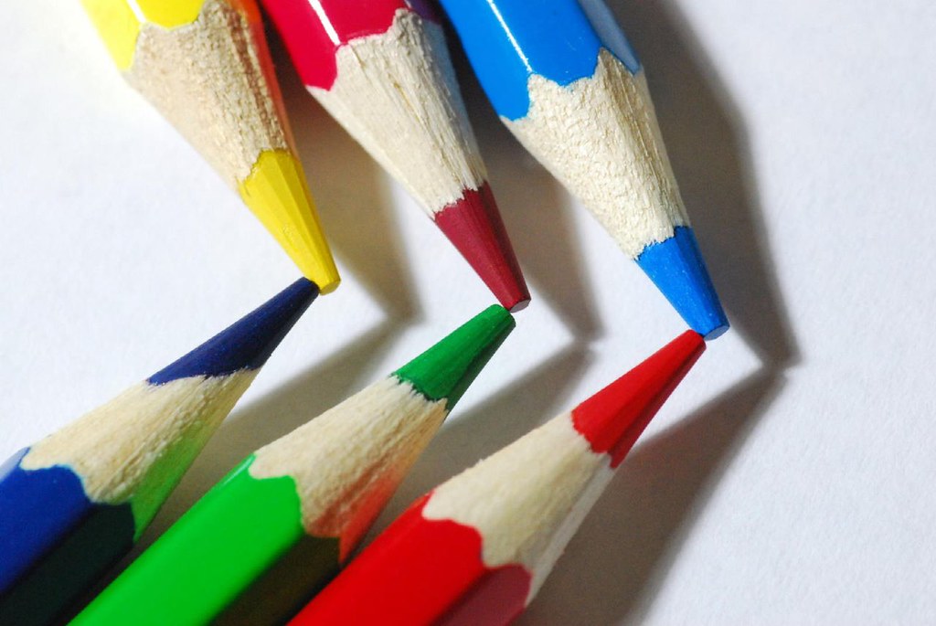
Color theory is the study of the relationships between colors. The three primary colors are red, blue, and yellow, and they are the basis for all the other colors. Secondary colors are formed by mixing two primary colors, and tertiary colors are made by combining a primary and a secondary color.
The Importance of Understanding Color Theory in Graphic Design
Understanding color theory is crucial in graphic design. The right color scheme can make a design stand out, evoke emotions, and create a lasting impression on viewers. A well-chosen color scheme can also help communicate information and convey a brand’s personality.
The Psychological Impact of Color in Design
Color has a profound effect on human psychology, and designers can use it to their advantage by tapping into the emotions and perceptions that colors evoke.
Color and Emotion: The Relationship between Color and Mood
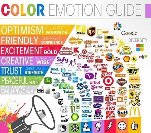
Colors can influence human emotions and create different moods. For example, yellow can evoke feelings of optimism and positivity, while blue can convey calmness and serenity. Understanding the psychology of color can help designers choose the right color combinations to evoke the desired emotional response from the audience.
Color Perception: How Color Can Affect Our Perception of a Design
Color can also affect our perception of a design, making it appear larger or smaller or more or less important. For example, a red object can look closer than a blue object, making it appear more prominent. Designers can use this to their advantage to manipulate a viewer’s perception of a design.
Color Combinations: Creating Harmony and Contrast
The combination of colors is a crucial aspect of graphic design. Designers use color combinations to create harmony and contrast in their designs.
The Color Wheel: An Overview of Color Relationships
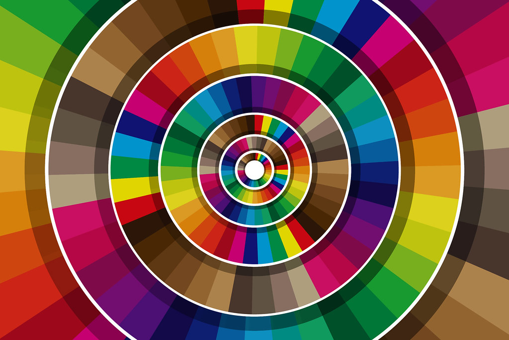
The color wheel is a tool that designers use to understand color relationships. It helps designers choose harmonious color combinations by identifying complementary, analogous, and monochromatic color schemes.
Color Schemes: Techniques for Creating Harmonious Designs
Different techniques can be used to create harmonious color schemes, such as using analogous colors or complementary colors. A well-chosen color scheme can make a design stand out and create a sense of unity.
Color Contrast: Strategies for Making Designs Stand Out
Color contrast is a design technique that involves using colors that are opposite on the color wheel to create visual interest and make elements stand out. Designers can use this technique to make important information or calls to action more noticeable.
Color and Branding: Building a Strong Visual Identity
Color plays a significant role in branding and can help businesses create a strong visual identity that is instantly recognizable.
Color and Brand Personality: Choosing Colors that Represent Your Brand
Brand personality is the image that a company wants to project to the public, and color is a crucial element in this process. Choosing the right colors that represent the brand’s personality can help create a strong visual identity that resonates with the target audience.
Color in Logo Design: Best Practices and Examples

Logos are an essential part of a business’s visual identity, and color plays a crucial role in logo design. Designers can use color to create a lasting impression and distinguish a brand from its competitors. Successful brands like Coca-Cola and McDonald’s have iconic logos that use bold and memorable colors to create a lasting impression on customers.
Applying Color Theory in Graphic Design Projects
Color theory is a fundamental element in graphic design. Whether you are creating a logo, brochure, or website, selecting the right colors can greatly impact the visual appeal and effectiveness of your design. This section will explore various techniques for applying color theory in graphic design for different projects.
Color in Typography: Techniques for Emphasizing Text
Typography plays an integral part in graphic design. Choosing the right color for your text can greatly emphasize your message and make it stand out. One technique is to use contrast in color. For example, if your background is a dark color, using white or bright-colored text can create a striking effect. Another technique is color harmony. Using complementary colors can create a harmonious balance and bring attention to your text. However, avoid using too many colors, as it can become overwhelming and distracting.
Color in Web Design: Best Practices and Considerations
Color is an essential component in web design, as it can affect the user’s emotions, behavior, and perception of the brand. When designing a website, consider the brand’s personality, target audience, and the website’s purpose. Using a consistent color palette throughout the website can establish visual hierarchy and create a cohesive look. Additionally, consider color accessibility for users with color blindness or vision impairments. Using high contrast or alternative color schemes can make your website more inclusive.
Color in Different Mediums: Understanding the Context
Different mediums require different considerations when it comes to color selection and implementation. This section will explore techniques for achieving accurate colors in print and digital design.
Color in Print Design: Techniques for Achieving Accurate Colors
Print design often requires more precise color management than digital design due to the limitations of printing processes. To achieve accurate colors, use a Pantone color system to ensure consistency across different mediums. Additionally, consider the color space and resolution of your images to ensure they are optimized for printing. Avoid using RGB images, as they are designed for digital screens and may not translate accurately to print.
Color in Digital Design: Considerations for Screen vs. Print
Digital design allows for more flexibility in color selection and implementation than print. However, consider the differences between screen and print and how they affect color perception. Screen calibration is crucial to ensure consistency across different devices. Additionally, consider the color gamut of different devices and adjust your color selection accordingly.
Tools and Resources for Color Selection and Implementation in Design
Choosing the right colors can be overwhelming, but there are various tools and resources available to help. This section will explore some popular software and online resources for color selection and management.
Color Tools: An Overview of Software and Online Resources
Software such as Adobe Color and Coolors offer color palette generators and tools for color selection and management. Additionally, websites like ColourLovers and Paletton offer community-generated color palettes and color theory resources.
Color Management: Best Practices for Consistent Color Across Different Platforms
Consistent color management is crucial for maintaining a cohesive brand and ensuring colors translate accurately across different mediums. Consider using color management software such as X-Rite, which provides custom color calibration and profiling for different devices.
The Future of Color in Graphic Design: Trends and Innovations
Color trends and innovations are constantly evolving in graphic design. This section will explore new color technologies and predictions for future color trends.
New Color Technologies: What’s on the Horizon for Color in Design?
New technologies such as extended color gamut printing and high dynamic range (HDR) displays offer more possibilities for color selection and implementation in design.
Color Trends in Design: Predictions and Examples
Color trends are influenced by various factors such as culture, fashion, and technology. In recent years, trends such as duotone and gradients have become popular in design. However, color trends can be unpredictable, and it’s important to stay informed and adaptable to the latest trends. In conclusion, color is a powerful tool in graphic design, and understanding how to use it effectively can take your designs to the next level. By following the principles of color theory, considering the psychological impact of color, and utilizing the right tools and techniques, you can create designs that are visually appealing and communicate your message clearly. So, go ahead and experiment with color, and let your creativity shine!
FAQ
What is color theory?
Color theory is the study of the relationships between colors, and how they interact with each other. It includes a basic understanding of the color wheel, color harmony, and color contrast, and is an important concept for any graphic designer to understand.
What is the psychology of color?
The psychology of color is the science behind how different colors can impact our emotions, behavior, and perception. It is an important consideration in graphic design, as the emotions and associations that different colors evoke can influence how people react to a design.
What are some common color schemes used in graphic design?
Some common color schemes used in graphic design include monochromatic, analogous, complementary, and triadic. Each of these schemes uses different combinations of colors to create a harmonious and visually appealing design.
What tools and resources are available for selecting and implementing colors in design?
There are a variety of tools and resources available for selecting and implementing colors in design, including color pickers, color palettes, and color management software. Many design software programs also include built-in color tools, such as Adobe Photoshop and Illustrator.

Is Crypto Futures Trading Worth the Risk? — A Spot
Crypto futures can enhance hedging and trading, but they also heighten risk through leverage and liquidation susceptibility. Investors seeking long-term…

How to Choose the Right Web Hosting Provider for Your
Choosing the right web hosting provider is a crucial decision for any business looking to establish a strong online presence….

AI-Powered Social Media Marketing: Strategies for Enhanced Brand Engagement
Unleash the potential of AI in social media marketing for better brand engagement. Discover effective strategies that leverage AI’s power…

Boost Your Income with Creativity: 6 Print on Demand Ideas
Print on Demand has emerged as an innovative and lucrative avenue for students to explore their creative talents while boosting…

10 Profitable Niche Markets for Graphic Designers to Explore in
The expanding world of graphic design in 2023The field of graphic design is rapidly evolving, driven by technological advancements and…

5 Proven Strategies to Monetize Your Graphic Design Skills in
The growing demand for graphic design skills in 2023The field of graphic design is experiencing a significant surge in demand…
Products you may like
-
Product on sale
 Canva Design PackOriginal price was: ₹699.00.₹99.00Current price is: ₹99.00.
 -
Product on sale
 AI PowerpackOriginal price was: ₹999.00.₹99.00Current price is: ₹99.00.
 -
Product on sale
 PSD CollectionOriginal price was: ₹799.00.₹99.00Current price is: ₹99.00.